A Beer Of The Streets
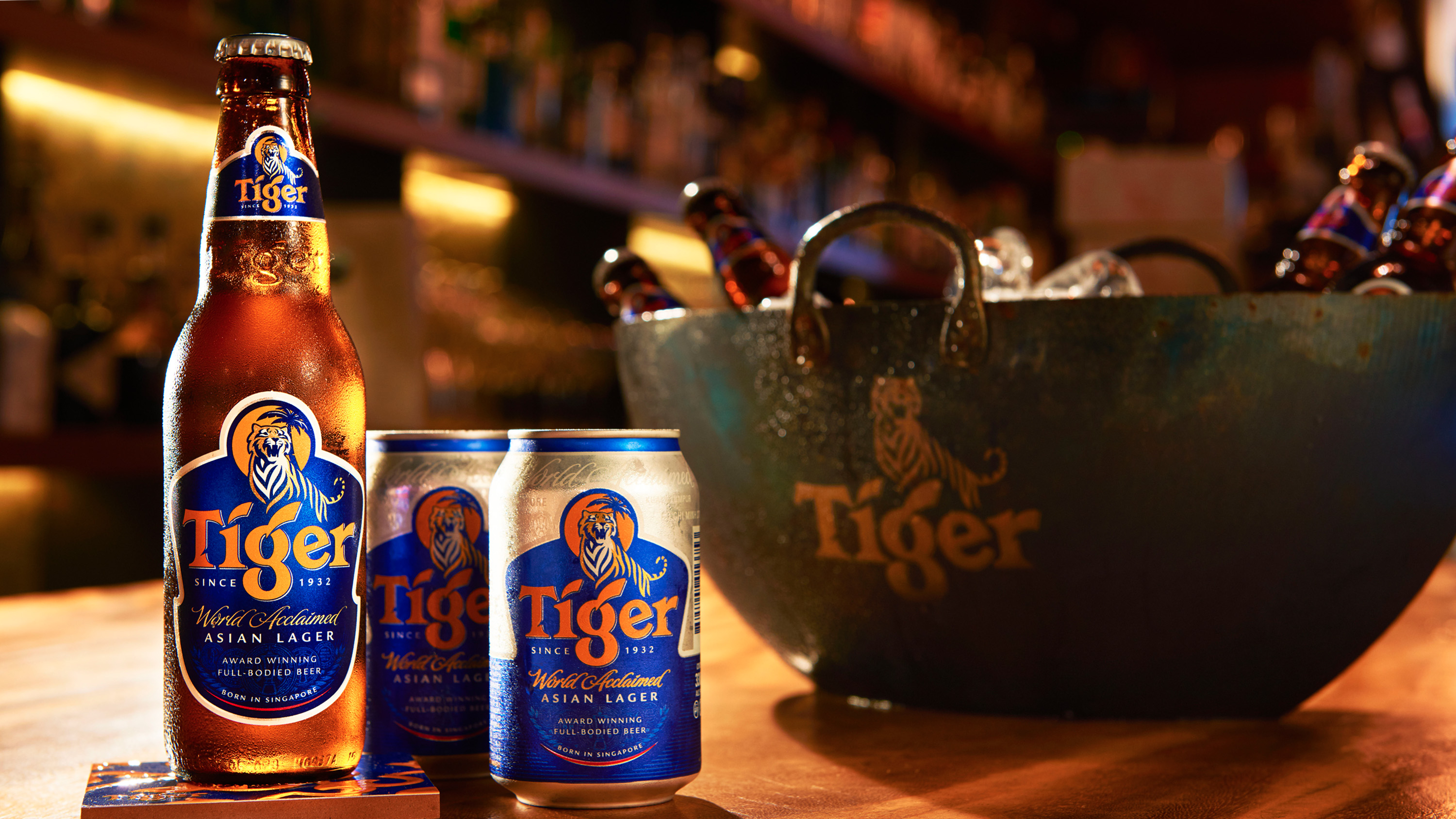
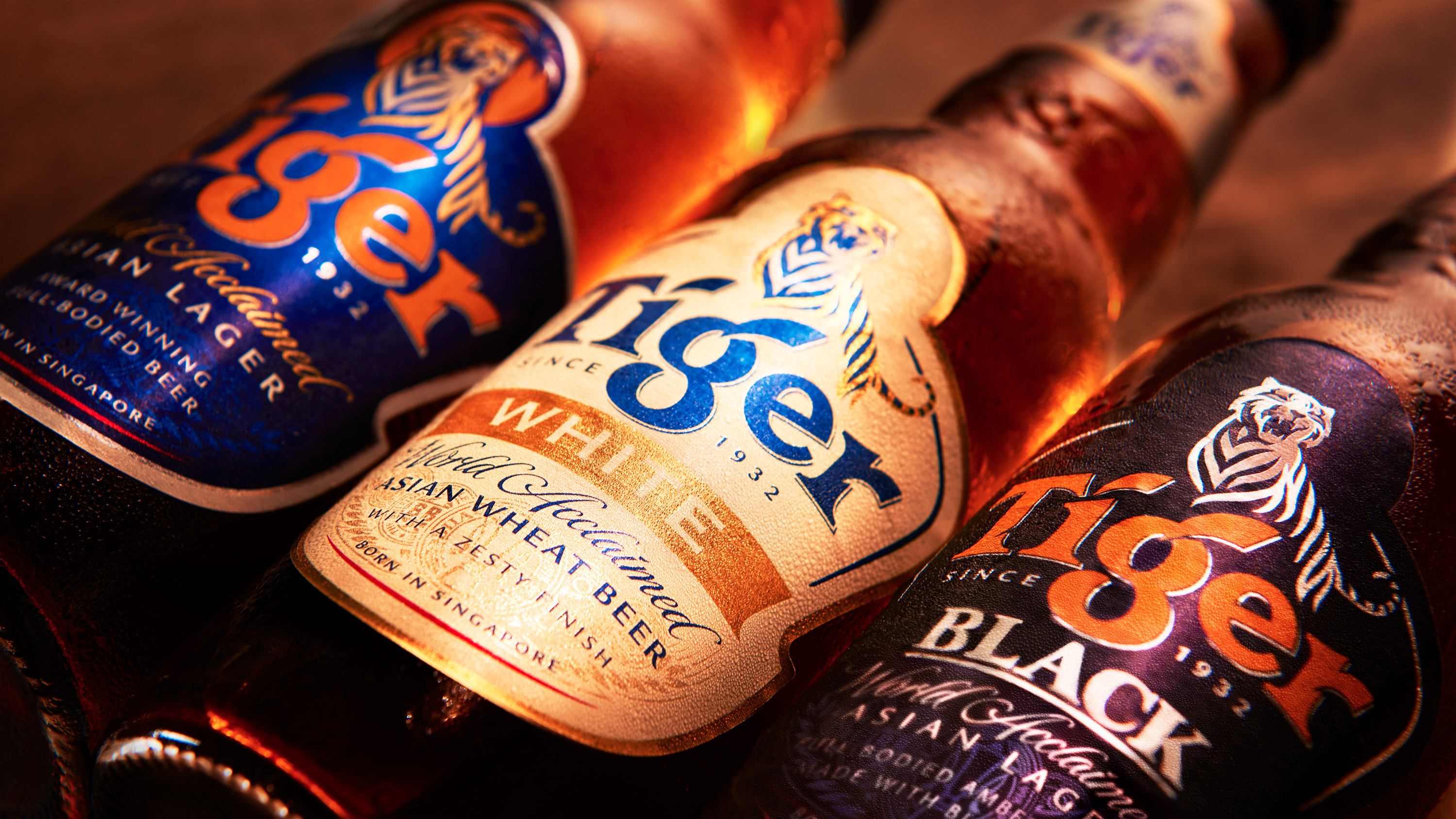
Born in Singapore and raised on the streets of Asia, Tiger is a beer with bite. The new design system places the brand’s distinctive tiger symbol front and centre of its iconography, the hero of a visual language that embraces the sights and textures of Asia’s vibrant streets.
Collapse
The Situation
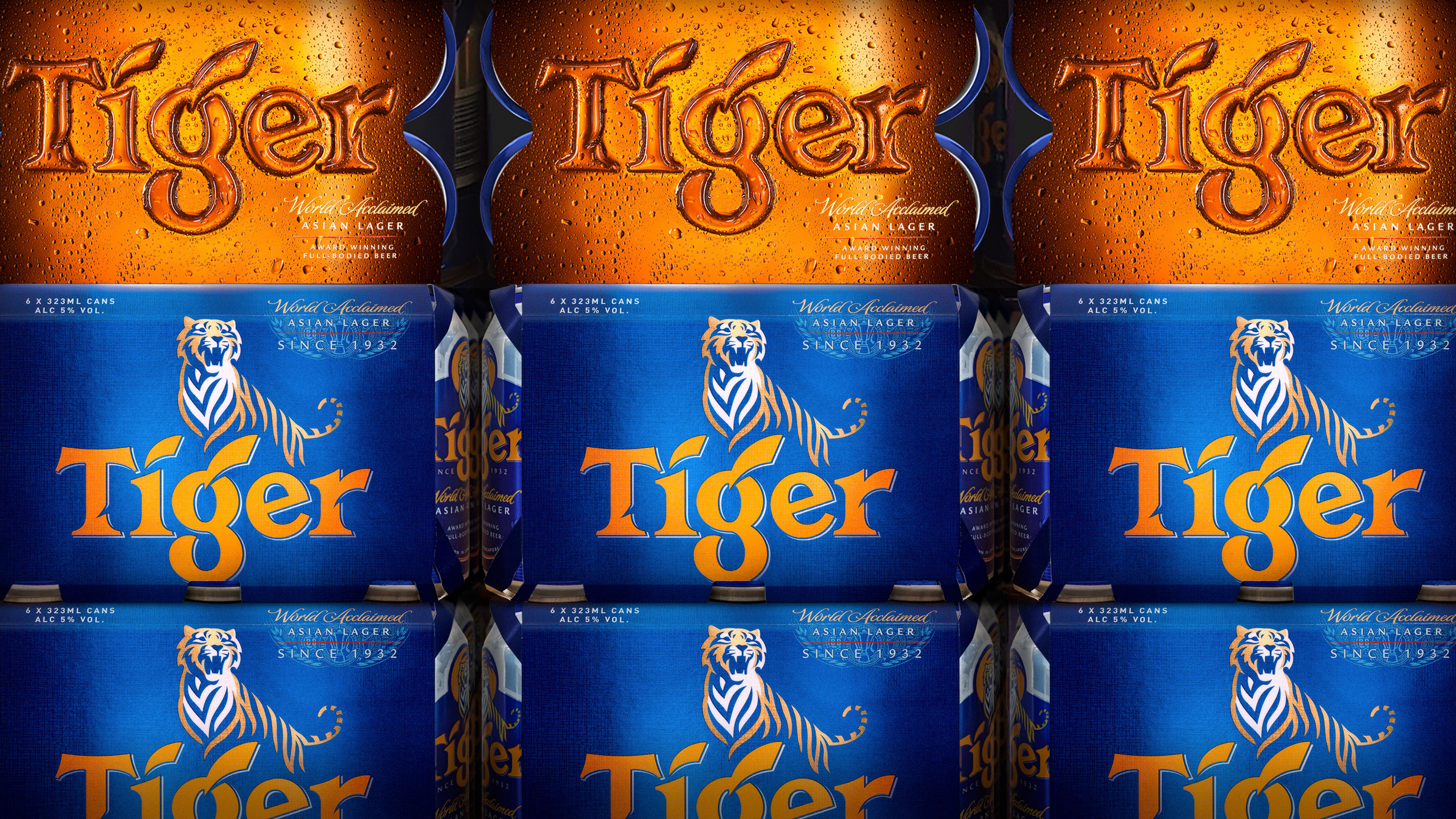
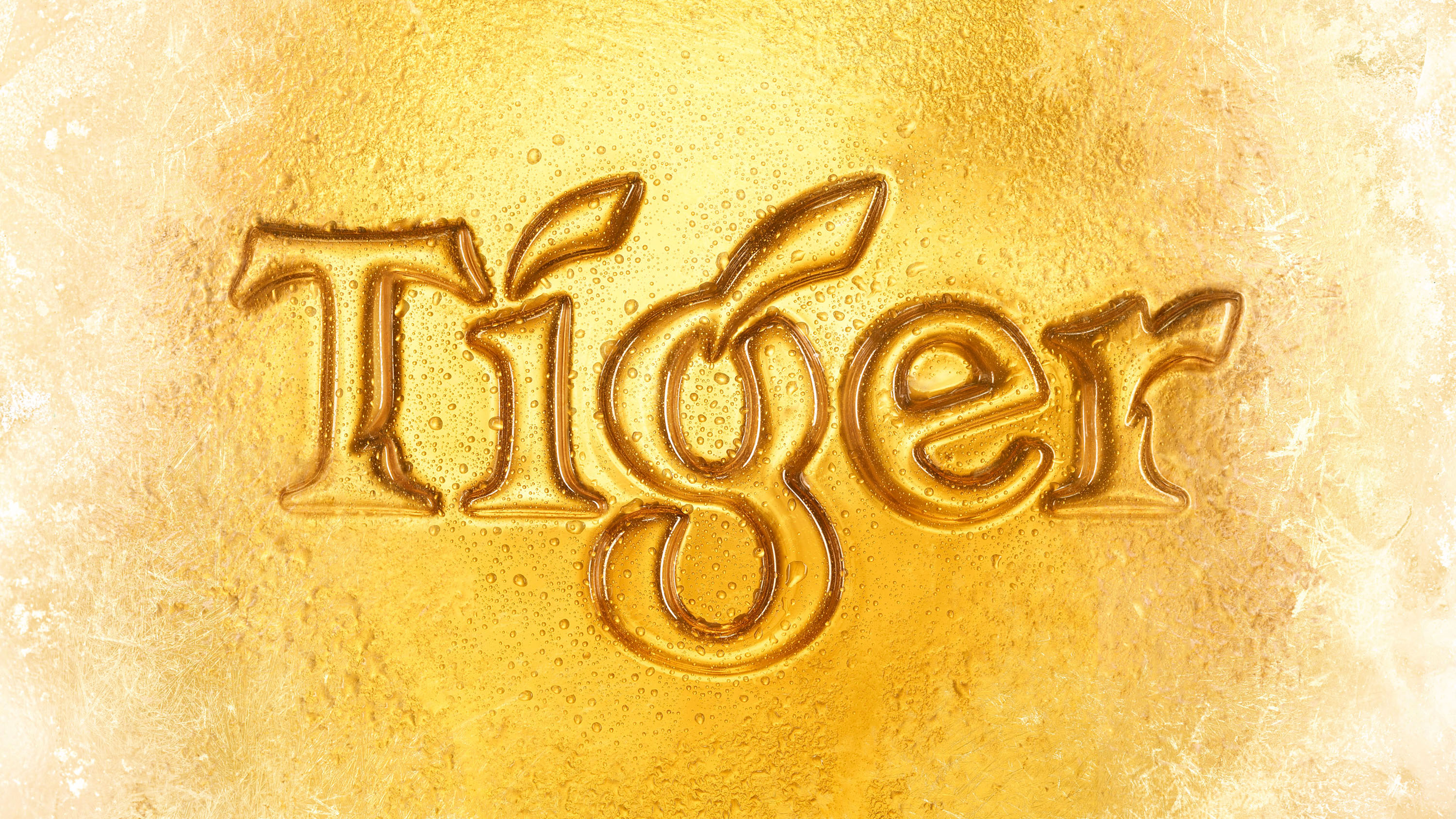
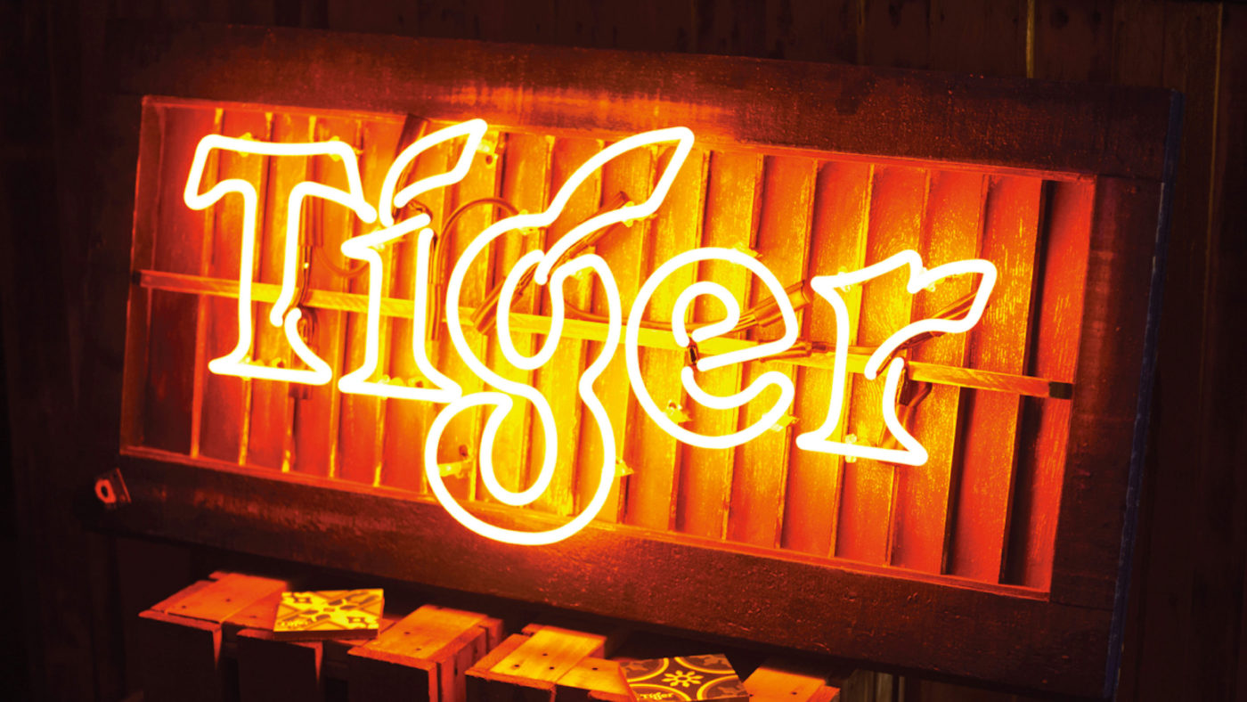
Tiger was born in 1932 in Singapore, the nation’s first locally brewed beer. As the brand continued to grow its global footprint, it needed a confident new identity system to take it from the streets of Asia to the streets of the world. Our task was to breathe new life into the brand’s identity, sensitively restoring its proud visual legacy whilst giving it a more single-minded expression. Details were everything: a prouder tiger was redrawn by hand, ‘uncaged’ to prowl around the logo; whilst a traditional sign painter created our on pack-copy on a canvas the size of a building.
The Solution
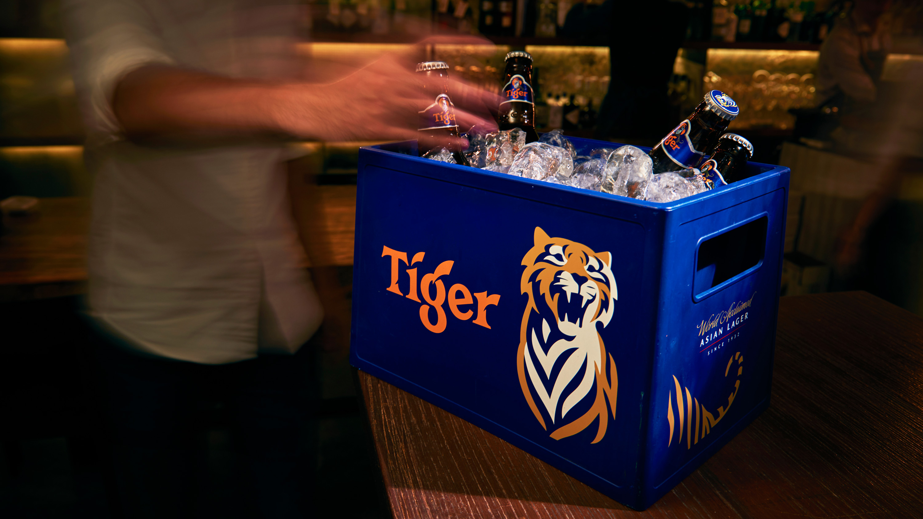
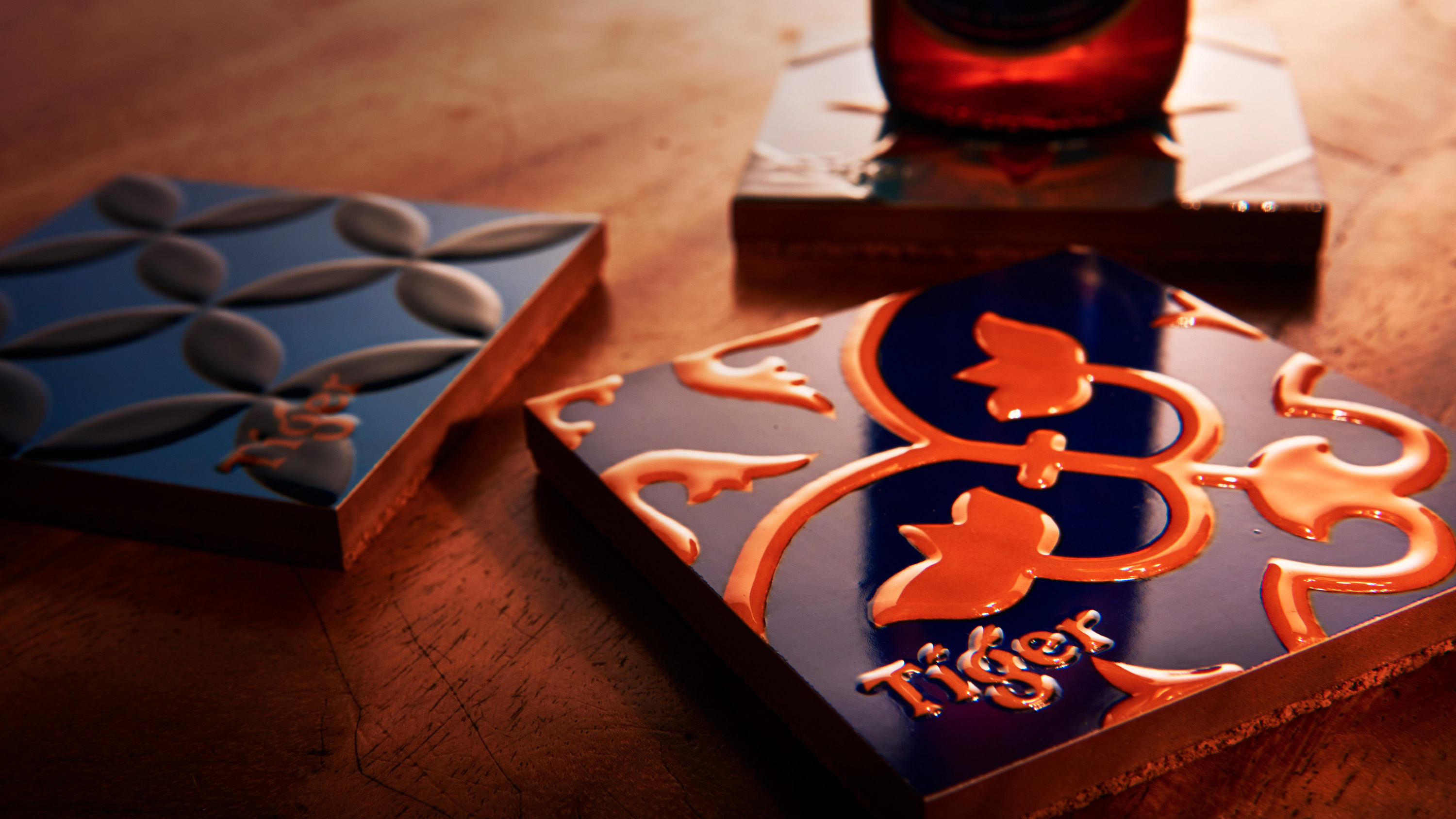
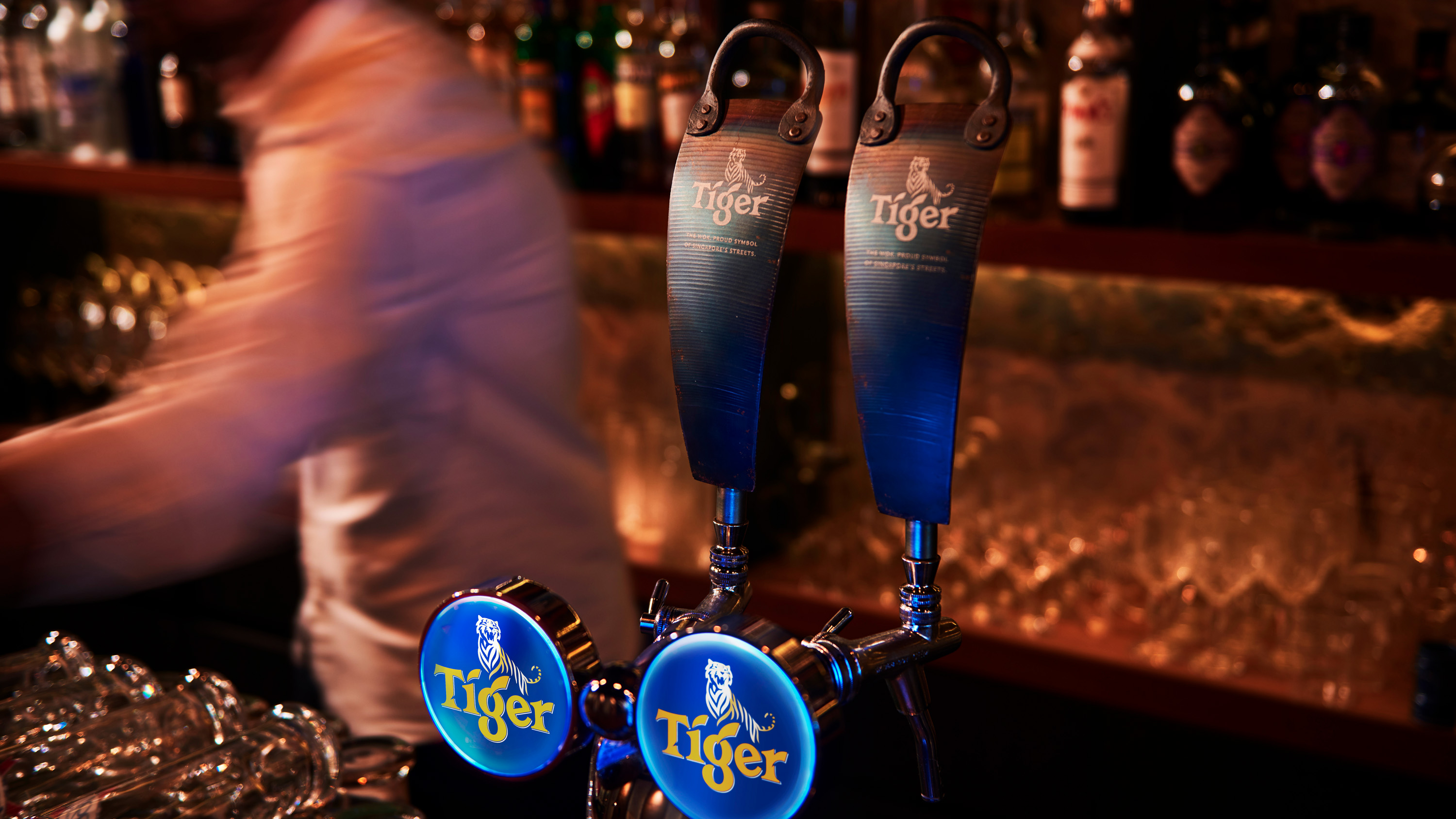
We partnered with Tiger to create a visual brand language that is infused with the spirit of the Asian streets. ‘Purposeful Repurposing’, our creative ethos, was about turning objects form the streets into part of our brand vocabulary. The ornate tiles from traditional Singapore ‘shop-houses’ were turned into beer coasters; beer crates were refashioned into cool bar seating; and woks from street food hawker sellers were recast as ice buckets and bar tap-handles. The approach gave Tiger the street cred to enter craft bar outlets in Australia and New Zealand, a channel normally closed to mass premium beers.